Over the past period, we have worked hard on a major update of vPlan. An update that not only brings significant visual changes, but also makes working in vPlan faster, easier and more enjoyable.
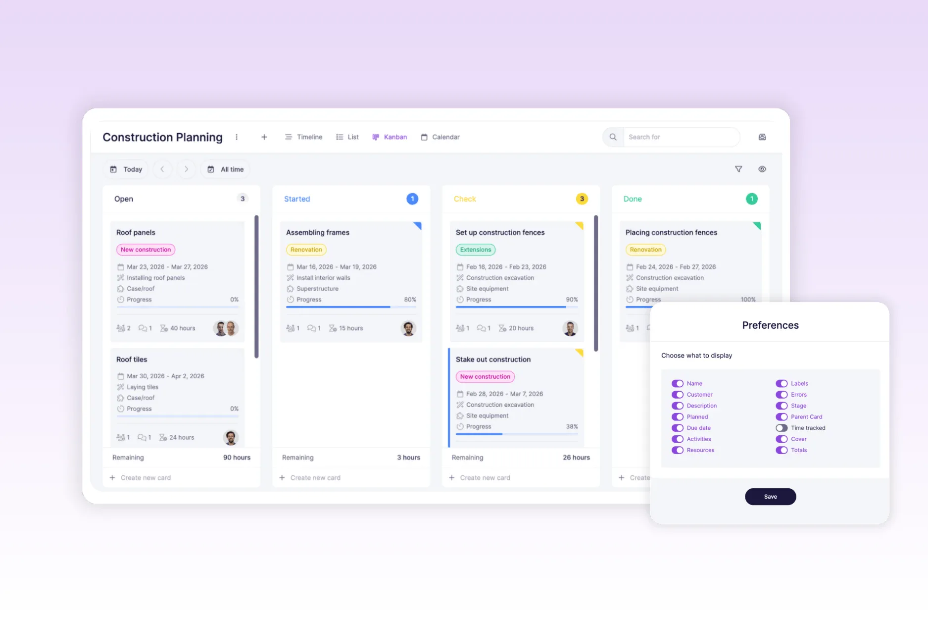
We have given both the card and the views a visual refresh. Everything looks fresher, more logical and more user-friendly. We will start with the design changes and then take you through the new functionalities that are now available.
Redesigned card layout
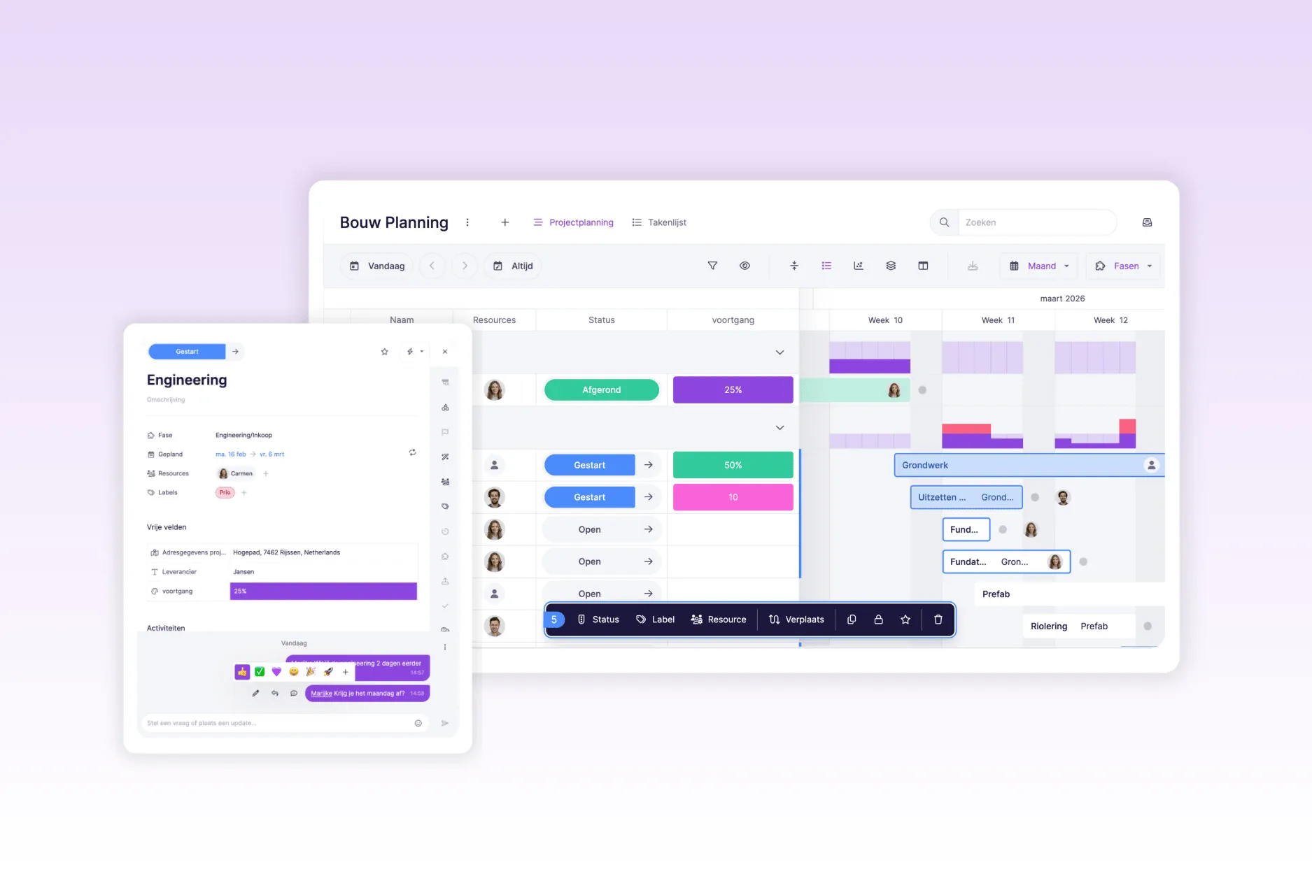
We start with the heart of vPlan: the card. It has been given a fresh, clear layout. Everything you are used to is still there, but in more logical places. This means you can see what you need more quickly.
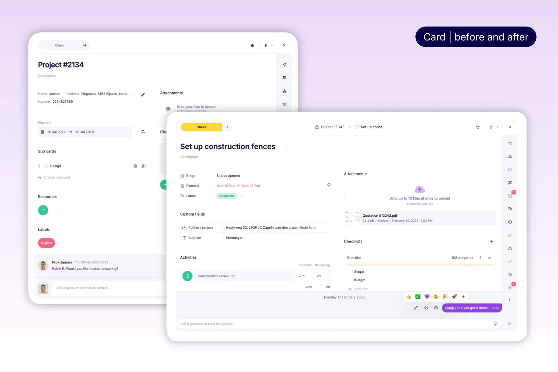
Elements such as the planned date, assigned resources and labels have been repositioned and redesigned. The custom fields have also been given a new place, making them easier to complete.
✅ Checklist
The checklist has also been given a new layout, and after adding a checklist you can now save it as a template. This no longer needs to be done within the settings of the plan board.
📅 Due date is now called Deadline
We have changed the term “due date” to “deadline”. Much clearer: this is the date by which it really needs to be completed. ℹ️ No worries: this change does not affect functionality or integrations.
🎊 Confetti for completed statuses
Do you change the status of the card to completed? Time for a celebration! Complete a status and you will get confetti 🎉. A small moment of joy, a great sense of satisfaction!
Big upgrade to communication
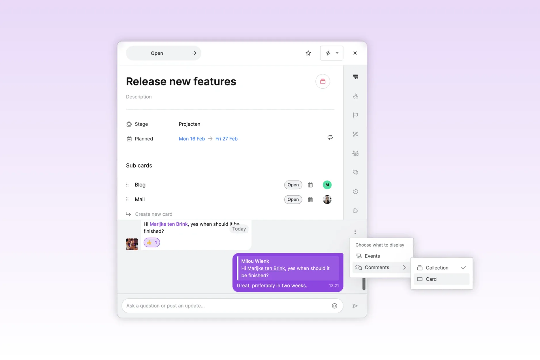
We have significantly improved “comments” within cards. Communication is now clearer, faster and feels much more like a real chat.
🗨️ New design and chat features
We have significantly expanded the “comment feature”. The comment field will now feel like a real chat, making conversations much easier to follow. You can reply to a specific message, so you can immediately see who is responding to what. In addition, you can now also react with emojis.
In short: collaborating via comments feels more natural, faster and a lot more enjoyable.
🔁 Reply at card or collection level
A much requested feature is now a reality: you can decide where comments are visible.
Do you work with a main card and multiple sub-cards within a project, for example project #14321 with sub-cards such as ‘Landing page design’ and ‘Web copy’? You can now choose whether to keep communication per card, or to show all comments across the entire collection of cards.
This way, you can keep your overview exactly how you prefer it, per item or centrally in one place. Flexible, just as it should be!
🔔 Grouping of notification emails
Decide how often you receive email notifications. You can now have them bundled hourly, daily or weekly, whatever suits your way of working best. Prefer to stay instantly up to date? You can of course still choose to receive notifications immediately, just as you are used to.
This way, you stay in control of your inbox and never miss important updates. 📬
New layout within views
We have also introduced more structure within the views for a more intuitive and faster experience. The navigation menu has been redesigned, so you can find what you are looking for more quickly and switch more easily between actions and settings.
↪ Navigation menu within views
For a better user experience, we have adjusted the structure within the navigation of views.
- On the left-hand side, you can now easily switch between periods (such as today) and use the date selection.
- On the right-hand side, you can configure everything: filters, preferences, scale (day–week–month–year), and the settings for timeline and dimensions.
The timeline settings (such as grouping and expanding/collapsing) have also moved to the right. This makes navigation faster and more intuitive.
This way, you can switch quickly on the left-hand side and easily adjust settings on the right-hand side.
🗂️ Backlog
The green backlog button is replaced with an icon in the same place. Collections are now created at the bottom of the backlog instead of at the top. More logical and clearer.
❓ Help center has a new location
The question mark has moved from the bottom right to the top right. This keeps your plan board nice and clear, while still allowing you to find help quickly.
📊 Capacity in the timeline
Capacity is displayed more visually. You can choose between the familiar arc view or the new bar chart. Whatever you prefer, adjustable via the eye icon 👁️.
⚡ Work faster and more easily
In addition to all the visual improvements, we have also paid a lot of attention to how vPlan works. vPlan is now noticeably faster, lighter and more intuitive to use. And that is not all: we have also added new functionalities that make planning even easier and smarter.
✅ Easily select cards
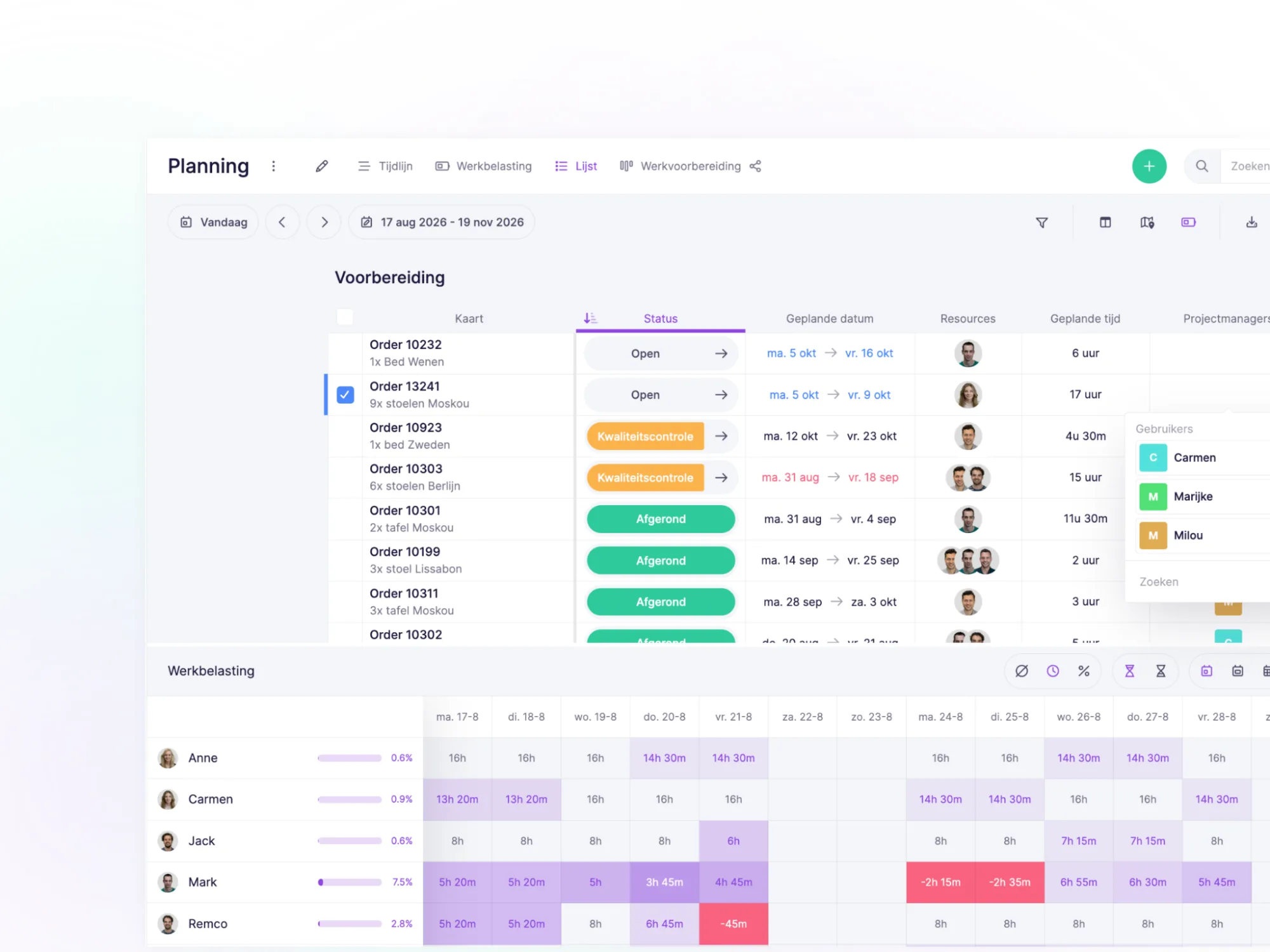
You will now see a checkbox in the list view and the timeline. This allows you to easily select multiple cards at once (up to 100!). Useful if you want to perform actions on a whole series of cards in one go.
📋 Bulk actions: do more at once
Have you selected multiple cards? Then you can edit them super quickly via the new bulk action menu.
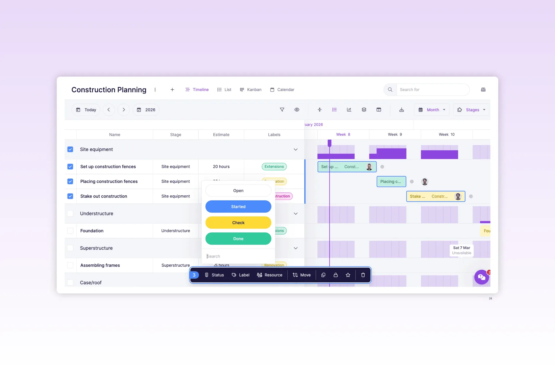
You can perform the following actions:
– Change status
– Add or remove labels
– Manage resources
– Move to another phase
– Adjust or shift the start date
– Duplicate cards
– Lock or unlock
– Follow or unfollow
– Delete
That saves a lot of time 💪
➕ Quickly create cards via the plus icon
We have added a plus icon that allows you to create new cards in no time. From here, you can immediately add the most important information, such as phase, resource and planned date.
Do you create a card via the plus icon? It will automatically appear on your plan board. This allows you to switch faster and keeps your planning always up to date.
🕒 Flexible work schedules
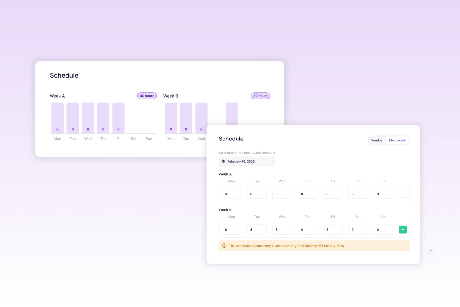
Do you work with employees who do not have the same schedule every week? Then we have good news: you can now add multiple schedules per employee and have them alternate weekly.
For example: Lisa has a 36-hour contract, but works 40 hours one week and 32 the next. With this new functionality, you can easily set that up. This makes capacity planning even more accurate and realistic.
🧬 Duplicate a planning board including cards
You can now duplicate an entire plan board, including all cards.
Ideal for recurring projects, events or standard workflows such as:
- An annual partner event
- Onboarding plans for new colleagues
- Standard project structures that you reuse regularly
This means you no longer have to build everything from scratch each time, but can start quickly and efficiently from a familiar template. It saves time and ensures consistency in your planning.
👤 Edit resources directly on the card
You can easily change and add resources to a card within the views. Click on the card in the calendar, Kanban, or timeline and assign the appropriate resources. This means the resource column is no longer necessarily required to modify resources.
🔄 Undo an action
Oops, accidentally deleted a card? No stress. After each bulk action, a pop-up appears in the bottom left of the screen allowing you to undo it for 8 seconds. Hover over the pop-up with your mouse? Then it will simply stay visible.
🏠 My cards on home: now 30 days ahead
Within the “your assigned cards” widget, you will now see all cards for the next 30 days instead of the next seven days. More overview, especially for longer planning.
📈 Progress visible directly on the card
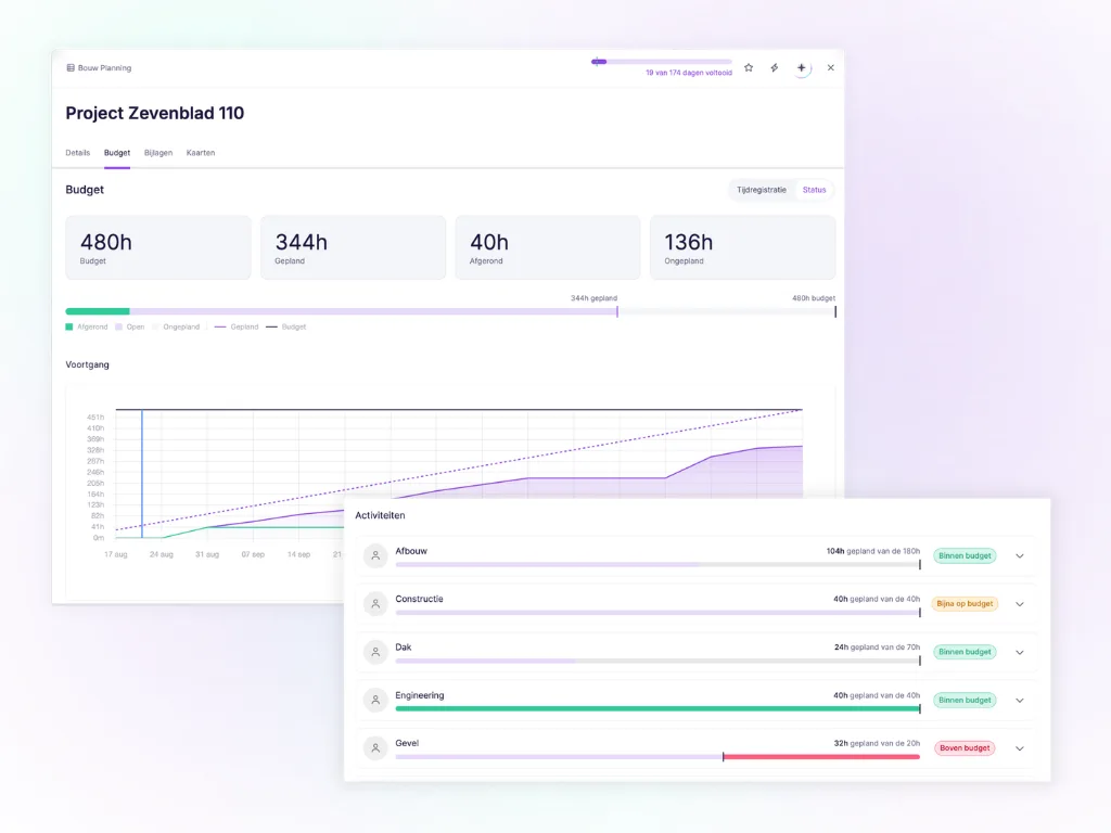
Progress can now also be seen at a glance on the card itself, based on the estimated and logged time. Prefer to keep your view a bit cleaner? Simply turn off progress via the eye icon. You decide.
The update is live! 🚀
We are curious to hear about your experiences. Dive in and discover all the improvements. Do you have feedback or run into anything? Let us know via support@vplan.com
Your input helps us to further improve vPlan!
Try it in your own vPlan
Every new feature is in the free trial.